Estimating accuracy when the reference standard is continuous
You have been given a datasheet "validity2.csv".
This
sheet is part of the the corrected data of a study done in the blood bank
AIIMS, Rishikesh.
The study
The study was about
the evaluation of two separate point-of-care devices to estimate hemoglobin,
which would be useful in donor selection in blood donation camps. The
hemoglobin could be tested both on capillary blood after a finger prick or on
venous samples. Using a finger prick is more convenient, but we had to check
whether using finger prick blood samples for hemoglobin would be accurate
enough. Also we decided to check the accuracy of the instruments on venous
blood, as a fall back if capillary hemoglobin was not accurate enough. Before
routine use, the instruments needed to be validated. In the original study, we
checked the accuracy of capillary and venous hemoglobin estimation on two
different instruments of two different instrument models (total of four
different instruments). We have included here the venous and capillary
hemoglobin estimation of two of these instruments. The reference measurement
was taken to be the hemoglobin estimated by an automated hematology analyzer
(Sysmex XP-100) which was validated
using standard laboratory protocols.
Import the data


ba
<- readXL("C:/Users/AIIMS/Desktop/forval2.xlsx", rownames=FALSE,
header=TRUE, na="", sheet="Sheet1", stringsAsFactors=TRUE)
The data
The datasheet has five variables
1. cap1: The hemoglobin estimated on
capillary finger prick sample on the first Point of care instrument (Hemocue 1)
2. cap2: The hemoglobin estimated on
capillary finger prick sample on the second Point of care instrument (Hemocue
2)
3. ven1: The hemoglobin estimated on venous
blood sample on the first Point of care instrument (Hemocue 1)
4. ven2: The hemoglobin estimated on venous
blood sample on the second Point of care instrument (Hemocue 2)
5: ref: The reference values of hemoglobin
as estimated by the reference equipment (Sysmex automated analyzer)
The examples will be shown for the
capillary and venous samples for point-of-care device 1. You will be expected
to do the analysis on point-of-care device 2 and share your results for
evaluation.
Initial Steps
1. What is the question?
What is the accuracy of hemoglobin
estimated by Hemocue 1 on capillary and venous samples on prospective blood
donors
2. How will it be useful?
If found accurate, the hemocue can not only
be used in the present blood bank, but will help other blood banks in providing
an easy choice to use the instrument. If not accurate, the various limitations
of the instrument or estimation technique need to be discussed, which will
again provide guidance to other blood banks.
How will we go about measuring the
accuracy?
We have to have an idea of how accurate is
"accurate enough". According to CLIA standards, the acceptable error
for hemoglobin is 7% at the critical point (Taken to be hemoglobin of 12.5 g/dL
for blood donors-below this you should not donate).
Error: Difference between index test and
reference test.
Therefore the acceptable error should be
below a hemoglobin within 7% of 12.5=0.875g/dL of the value reported by the
reference method.
The acceptable error depends on the
standards adopted. There may be stricter or more lenient guidelines for
acceptable error and depends on the setting, or it may be done on the basis of
subjective judgment. However, the acceptable error should be justifiable.
Any statistical analysis has the following
steps:
1. Describe
2. Visualize
3. Test
4. Infer
5. Discuss the generalizability
But before that:
What type of variable is the index test?
Continuous
What type of variable is the reference
test?
Continuous
Describe
Use the numerical summary of the variables.
Mean, Median, Quartiles, Minimum, Maximum
for the variable
Standard deviation, Interquartile range and
range for the variation


#####Numerical
summaries#####
res
<- numSummary2(ba[,c("cap1", "cap2", "ref",
"ven1", "ven2")], statistics=c("mean",
"u.sd", "quantiles"), quantiles=c(0,.25,.5,.75,1))
colnames(res$table)
<- gettext(domain="R-RcmdrPlugin.EZR", colnames(res$table))
res
## mean u.sd
0% 25% 50%
75% 100% n NA
##
cap1 15.00351 1.353298 11.2 14.20 15.00 15.800 18.1 57 57
##
cap2 14.64364 1.143057 12.3 13.85 14.70 15.400 17.2 55 59
##
ref 15.48158 1.267467 10.8 14.90 15.60
16.375 18.5 114 0
##
ven1 15.69474 1.295659 10.9 15.05 15.90 16.600 18.0 114 0
##
ven2 15.33947 1.355723 10.1 14.65 15.55 16.200 17.8 114 0
u.sd:
corrected standard deviation, 0% : Minimum, 25%: First quartile, 50%: Median,
it is the second quartile, 75%: Third quartile, 100%: Maximum, n=number of
measurements, NA: Missing data
Visualize
Click
on the “graphs and tables” in the menu. You will be able to do the histogram,
boxplot, scatterplot and quantile comparison plot via this part of the menu
#####Histogram#####

HistEZR(ba$cap1,
scale="frequency", breaks="scott",
xlab="cap1",
col="darkgray")

##
11-12 12-13 13-14 14-15 15-16 16-17 17-18 18-19
## 1
4 8 16
15 10 2
1
These
represent the widths of the histogram bars (categories)and the number of
observations in each category
#####Boxplot#####

For
boxplot it is advisable to set the whisker range as 1Q-1.5*IQR to 3Q+1.5*IQR
(IQR=Interquartile range. This is a default in base R

boxplot(ba$cap1[complete.cases(ba$cap1)],
ylab="cap1")
#####Histogram#####
HistEZR(ba$ven1,
scale="frequency", breaks="scott",
xlab="ven1",
col="darkgray")

##
10-11 11-12 12-13 13-14 14-15 15-16 16-17 17-18
## 1
1 4 7
16 37 39
9
#####Boxplot#####
boxplot(ba$ven1[complete.cases(ba$ven1)],
ylab="ven1")

#####Histogram#####
HistEZR(ba$ref,
scale="frequency", breaks="scott",
xlab="ref",
col="darkgray")

##
10-11 11-12 12-13 13-14 14-15 15-16 16-17 17-18 18-19
## 1
1 3 8
22 41 30
6 2
#####Boxplot#####
boxplot(ba$ref[complete.cases(ba$ref)],
ylab="ref")

Visualization is
important since it gives an idea of the shape of the distribution and also
gives an idea about any potential outliers.
Other methods to
visualize continuous data
1.
Density plots
2.
Violin plots
3. Dot plots
Visualize the
relationship between the variables of interest
#####Scatterplot:
Reference test as x-variable, index as y-variable#####
scatterplot(cap1~ref,
regLine=FALSE, smooth=FALSE, boxplots='xy', data=ba)

#####Scatterplot#####
scatterplot(ven1~ref,
regLine=FALSE, smooth=FALSE, boxplots='xy', data=ba)

Looking at
the scatterplot itself, we can see that the points for capillary estimation
show a greater scatter, representing greter difference from the reference, and
therefore, greater error
We are to a large
extent dealing with the difference between the index test and reference test,
so describe and visualize the difference also.
#####Create new variable representing the
difference between index test and reference: Capillary blood#####
ba$cap1ref <- with(ba, cap1- ref)
#New
variable cap1ref was made.
#####Create
new variable representing the difference between index test and reference:
Venous blood#####
ba$ven1ref
<- with(ba, ven1- ref)
#New
variable ven1ref was made.
#####Histogram#####
HistEZR(ba$cap1ref,
scale="frequency", breaks="scott",
xlab="cap1ref",
col="darkgray")

##
-2.5--2 -2--1.5 -1.5--1 -1--0.5
-0.5-0 0-0.5 0.5-1
1-1.5
## 4
4 6 13
18 9 2
1
#####Histogram#####
HistEZR(ba$ven1ref,
scale="frequency", breaks="scott",
xlab="ven1ref",
col="darkgray")

The difference between venous measurement
and hemoglobin and reference shows a left skew and a possible outlier on the
lower side. We decided to keep it nonetheless.
Whether the data can be adequately be
described by a Gaussian distribution can be checked by a qq-plot
In a qq-plot, the points should be
approximately on a straight line (A perfect Gaussian distribution probably does
not exist in nature)

#####Quantile-comparison
plot#####
qqPlot(ba$cap1ref,
dist="norm")
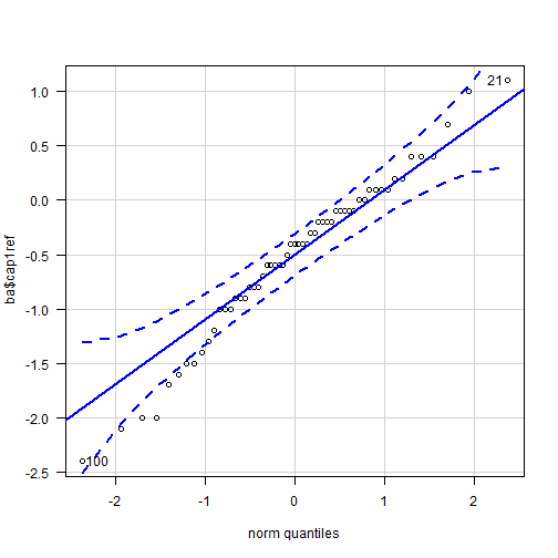
The
points in the quantile comparison plot for the differences between the
capillary method and the reference seems to be roughly linear. A long pencil
would cover all the points if laid on the graph. This shows that the the data
approximately may be treated as following a Gaussian distribution. There is a
mild deviation in the linearity at the lower end, but I would not be too
concerned about it since we are dealing with a moderately large sample size.
Real life data are rarely perfect.
#####Quantile-comparison
plot#####
qqPlot(ba$ven1ref,
dist="norm")
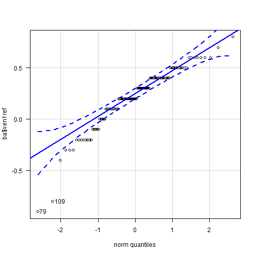
The quantile comparison
plot is linear in the central and top-left portions, but a marked deviation at
the lower end. We should be more careful about assuming approximate Gaussian
distribution. The skewed distribution we saw earlier will inflate the standard
deviation. We still used the assumption of Normality in this case because, as
we will see later, the spread and limits
of agreement, which depend on the standard deviation, still fall within
acceptable limits inspite of the increased standard deviation.
Also,
the sample size is reasonably high. At high sample sizes, inferences about the
mean of a variable still hold due to what is known as the central limit
theorem.
#####Numerical summaries#####
res <-
numSummary2(ba[,c("cap1ref", "ven1ref")], statistics=c("mean", "u.sd", "quantiles"),
quantiles=c(0,.25,.5,.75,1))
colnames(res$table)
<- gettext(domain="R-RcmdrPlugin.EZR",
colnames(res$table))
res
## mean u.sd
0% 25% 50%
75% 100% n NA
## cap1ref -0.5280702
0.7523189 -2.4 -0.9 -0.4 -0.1 1.1 57 57
## ven1ref 0.2131579 0.2826903 -0.9 0.1
0.2 0.4 0.8 114
0
Realize
what the mean and standard deviation means.
95%
of the differences between capillary hemoglobin estimation by Hemocue1 and the
reference will be between mean +1.96SD
and mean -1.96SD.
Mean
+1.96SD of the difference is higher than
0.875 and mean -1.96 SD is far lower than -0.875, i.e. the instrument will give
unacceptable results more than 5% of the time. Is that good enough.I would say
no
Do
the same for the venous method on instrument 1
The absolute value of the Mean of the
difference +1.96 S.D. of the difference as well as Mean of the difference -
1.96 S.D. of the difference is below 0.875. In fact, Mean +-3.SD of the
difference has an absolute value lesser than the acceptable error of 0.875.
This method is likely to be sufficiently accrate for our purpose, IMO.
These limits Mean+1.96
SD. of the difference and mean -1.96 S.D of the difference are known as the
Bland Altman limits of agreement
Are just these limits sufficient?
1. You should plot the data to see whether
the variation in the difference is constant over the measured range of values.
2. You should calculate the 95% C.I. of
these limits. In order to justify accuracy at the 5% level, the C.I. should
entirely lie within the acceptable accuracy.
Plot
The scatterplot with the difference on the
y-axis and the average of the measurements per subject, along with the mean
difference (bias) and the limits of agreement represented is known as the Bland
Altman plot
For
this we have to create a new variable representing the average value of the
index test and the reference test
#####Create
new variable#####
ba$cap1refavg
<- with(ba, (cap1+ ref)/2)
#New
variable cap1refavg was made.
#####Create
new variable#####
ba$ven1refavg
<- with(ba, (ven1+ ref)/2)
#New
variable ven1refavg was made.
#####Scatterplot#####
scatterplot(cap1ref~cap1refavg,
regLine=FALSE, smooth=FALSE, boxplots=FALSE,
data=ba)
abline(h=mean(ba$cap1ref,
na.rm=TRUE))
abline(h=mean(ba$cap1ref,
na.rm=TRUE)+1.96*sd(ba$cap1ref, na.rm=TRUE))
abline(h=mean(ba$cap1ref,
na.rm=TRUE)-1.96*sd(ba$cap1ref, na.rm=TRUE))

The differences need to distributed with a
uniform width along the x-axis. The above graph seems to be reasonably
satisfactory for inference. Note that the limits of agreement are beyond the
limits set for acceptable difference, which we set to be 0.875 g/dL at the
beginning of the experiment. This represents poor accuracy.
scatterplot(ven1ref~ven1refavg,
regLine=FALSE, smooth=FALSE, boxplots=FALSE, data=ba)
abline(h=mean(ba$ven1ref,
na.rm=TRUE))
abline(h=mean(ba$ven1ref,
na.rm=TRUE)+1.96*sd(ba$ven1ref, na.rm=TRUE))
abline(h=mean(ba$ven1ref,
na.rm=TRUE)-1.96*sd(ba$ven1ref, na.rm=TRUE))

The
above graph also seems to be reasonably satisfactory.Note that the limits of
agreement are within the limits set for acceptable difference, which we set to
be 0.875 g/dL at the beginning of the experiment. This represents good
accuracy.
Let
us look at the limits of agreement again
mean(ba$cap1ref,
na.rm=TRUE)+1.96*sd(ba$cap1ref, na.rm=TRUE)
##
[1] 0.9464748
mean(ba$cap1ref,
na.rm=TRUE)-1.96*sd(ba$cap1ref, na.rm=TRUE)
##
[1] -2.002615
mean(ba$ven1ref,
na.rm=TRUE)+1.96*sd(ba$ven1ref, na.rm=TRUE)
##
[1] 0.767231
mean(ba$ven1ref,
na.rm=TRUE)-1.96*sd(ba$ven1ref, na.rm=TRUE)
##
[1] -0.3409152
For
comparing the accuracy of these two methods, we may set the y-axis to have
similar scale. A narrower limit of agreement is better. We can visualize that
the accuracy of the venous method is better.


For
finding the confidence intervals, we have to make use of a specialized package
in R and use the command line (sorry)
Type
the following command to install a package
install.packages(“blandr”)
Load
the package
library(blandr)
For capillary method
Use the following
command:
blandr.output.text(ba$cap1,
ba$ref, sig.level = 0.95)
##We had imported the
datasheet under the name ba
The important parts of
the results below have been bolded.
##
Number of comparisons: 57
##
Maximum value for average measures: 17.9
##
Minimum value for average measures: 11.4
##
Maximum value for difference in measures:
1.1
##
Minimum value for difference in measures:
-2.4
##
## Bias:
-0.5280702
## Standard deviation of bias: 0.7523189
##
##
Standard error of bias: 0.09964707
##
Standard error for limits of agreement:
0.1712953
##
##
Bias: -0.5280702
##
Bias- upper 95% CI: -0.3284531
##
Bias- lower 95% CI: -0.7276872
##
##
Upper limit of agreement: 0.9464748
##
Upper LOA- upper 95% CI: 1.28962
##
Upper LOA- lower 95% CI: 0.6033292
##
##
Lower limit of agreement: -2.002615
##
Lower LOA- upper 95% CI: -1.65947
##
Lower LOA- lower 95% CI: -2.345761
##
##
Derived measures:
##
Mean of differences/means: -3.521315
##
Point estimate of bias as proportion of lowest average: -4.632195
##
Point estimate of bias as proportion of highest average -2.950113
##
Spread of data between lower and upper LoAs:
2.94909
##
Bias as proportion of LoA spread:
-17.90621
##
##
Bias:
## -0.5280702
( -0.7276872 to -0.3284531 )
##
ULoA:
## 0.9464748
( 0.6033292 to 1.28962 )
##
LLoA:
## -2.002615
( -2.345761 to -1.65947 )
For
venous method:
Use
the following command
blandr.output.text(ba$ven1,
ba$ref, sig.level = 0.95)
##
Number of comparisons: 114
##
Maximum value for average measures: 18.1
##
Minimum value for average measures:
10.85
##
Maximum value for difference in measures:
0.8
##
Minimum value for difference in measures:
-0.9
##
##
Bias: 0.2131579
##
Standard deviation of bias: 0.2826903
##
##
Standard error of bias: 0.02647638
##
Standard error for limits of agreement:
0.04537998
##
##
Bias: 0.2131579
##
Bias- upper 95% CI: 0.2656124
##
Bias- lower 95% CI: 0.1607034
##
##
Upper limit of agreement: 0.767231
##
Upper LOA- upper 95% CI: 0.8571369
##
Upper LOA- lower 95% CI: 0.6773251
##
##
Lower limit of agreement: -0.3409152
##
Lower LOA- upper 95% CI: -0.2510093
##
Lower LOA- lower 95% CI: -0.4308211
##
##
Derived measures:
##
Mean of differences/means: 1.355775
##
Point estimate of bias as proportion of lowest average: 1.964589
##
Point estimate of bias as proportion of highest average 1.177668
##
Spread of data between lower and upper LoAs:
1.108146
##
Bias as proportion of LoA spread:
19.23554
##
##
Bias:
## 0.2131579
( 0.1607034 to 0.2656124 )
##
ULoA:
## 0.767231
( 0.6773251 to 0.8571369 )
##
LLoA:
## -0.3409152
( -0.4308211 to -0.2510093 )
For
the venous method, the bias is lesser. We also note that the Confidence
intervals of the limits of agreement all lie within the interval 0.875 and
-0.875, represent maximum acceptable error.
We
can incorporate the entire confidence intervals in the Bland-Altman plot, as
well as represent the maximum acceptable error. In the examples below, the
maximum acceptable errors are represented by a red solid line. As we will see
below, for the capillary method, plenty of measurements as well as the limits
fall outside the acceptable line. For venous method they do not.
blandr.draw(ba$cap1,
ba$ref, method1name = "Capillary1",
method2name =
"Reference", lowest_y_axis = -2.5, highest_y_axis = 1.2, point_size =
0.8, plotter = "rplot")
abline(h=0.875,
col="red")
abline(h=-0.875,
col="red")

blandr.draw(ba$ven1,
ba$ref, method1name = "Venous1", method2name =
"Reference", point_size = 0.8,
plotter = "rplot")
abline(h=0.875,
col="red")
abline(h=-0.875,
col="red")

Conclusion
The capillary method for estimating hemoglobin via Hemocue performs
poorly, but not the venous method. This is generalizable to only blood donors.
Comments
Post a Comment